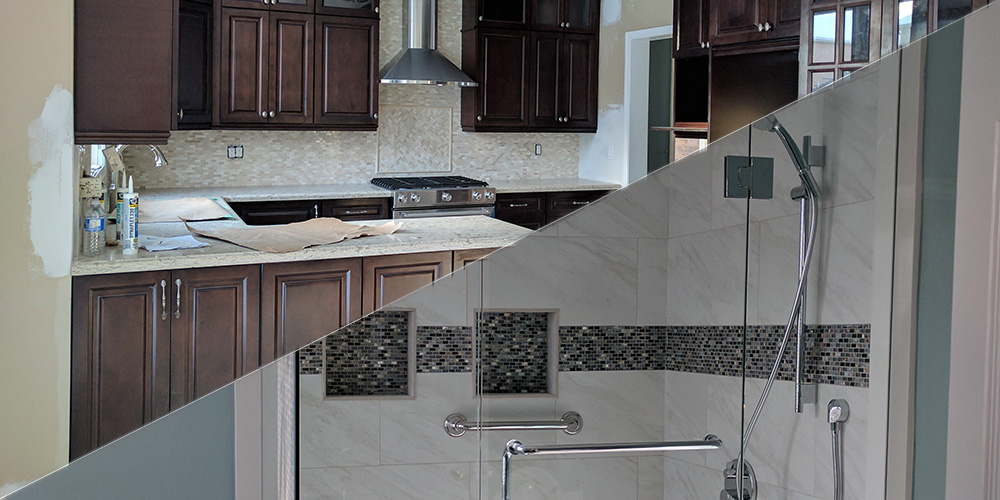
This client wanted a new bathroom and kitchen design. While it is possible to achieve very distinct designs in the bathroom and kitchen space, our goal was to create a cohesive look and feel.
Bathroom Design
In a small place like a bathroom, we know that every feature matters. We had to be keen when choosing all the details, from the tilework to the lighting and wall color. Every aspect of the design was chosen to bring out a unique character and stand out exceptionally well.
The previous design was slightly dull and plain. We managed to transform this to an over-the-top design that the client loved. One major transformation was painting the wall white. A few features were left intact such as the tiles on the shower area and glass door enclosure. The glass opened up the space and we needed it to make the room more airy.
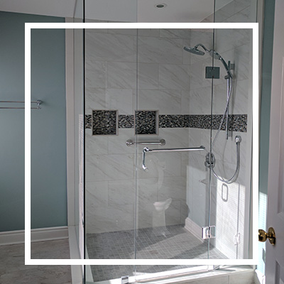
We replaced a couple of fixtures such as the showerhead with a more modern and functional alternative. The master bathroom also needed a custom vanity with drawer dividers, a beautiful mirror and cabinets. New backsplashes along with beautiful fixtures also contributed to giving the bath a modern vibe.
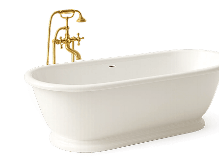
We also added some extra counter space to the bathroom. Often, shower rooms have limited space to work with but this expansive design allowed us to play around with lots of design features. The unique countertop allowed us to create an instant wow factor not to mention the voluminous sinks and stunning faucet that added some drama and style in the space.
Kitchen Design
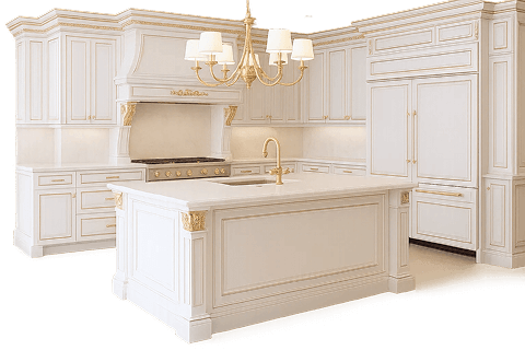
When it comes to the kitchen we wanted to stick to the gray and white color scheme to lighten up the place. We even transformed the sink to make it eye-catching and more functional for the homeowner. The task lighting that was beautifully set just above the island added some more drama in the space and illuminated the area.
The initial design was spacious but not inviting at all. We made some noteworthy changes to this design to improve functionality and boost its aesthetic appeal. We got rid of the old cabinetry and tile counters and instead installed white cabinets with pull in drawers and cool drawer pulls and handles to spice up their look.
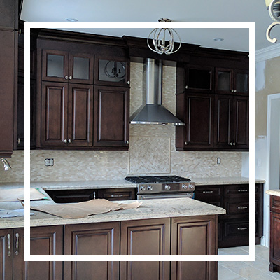
The kitchen featured clean lines to give a modern and classy charm. The stainless-steel appliances contributed to improving the overall design. We ensured there’s more space to work with on the counters by fitting the major appliances in their respective spots. The new design also has lots of storage areas above and below the counters.
One remarkable change was the brick backsplash which contrasts beautifully with the flooring and countertop. We love how well every feature in this modern kitchen blends with the other components. This kitchen remodel is perfect if you have a spacious place but want to bring out your unique personality by adding some style and charm while improving its functionality.


