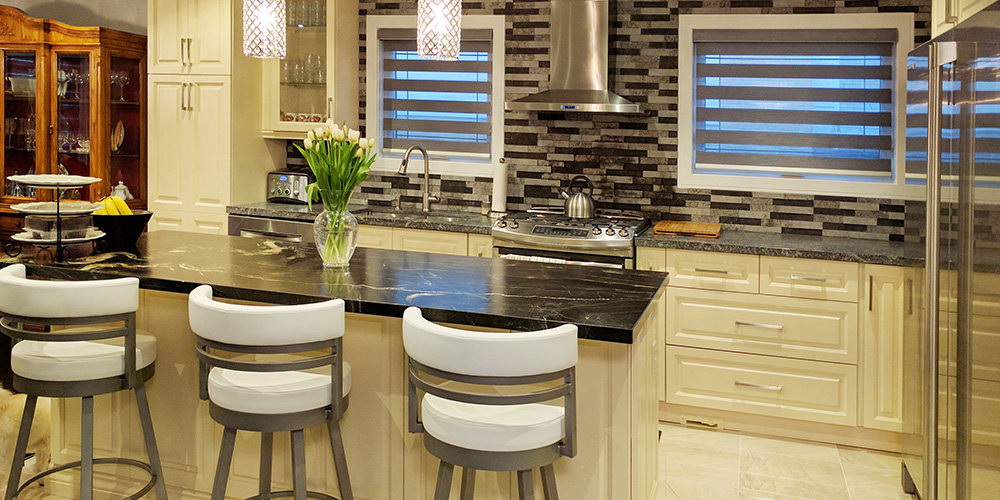
Want a kitchen remodel that looks uniquely yours? This one should give you lots of inspiration to select your favorite cabinets, countertops backsplash, faucet and other elements, according to your personality.
There are certain elements in the existing kitchen that were fine – they were left intact. Others needed some major upgrades. The cabinets were worn out and needed some repairs. The existing cabinets looked old and outdated so they needed a new finish to transform the entire place.
The sleek stainless-steel sink
The sink together with the single handle faucet added a sleek finish. We made sure the finish on other hardware elements make a pretty good pair that is functional too. The faucet can swivel 360 degrees to make cleaning and rinsing dishes a breeze.
The hood
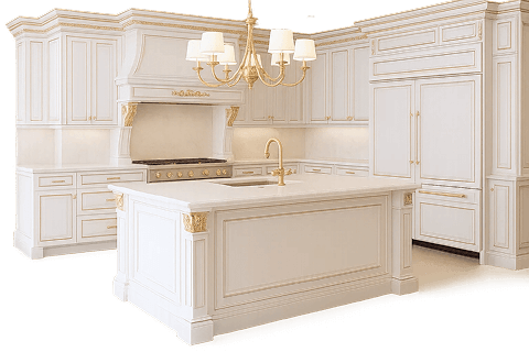
The current kitchen has a hood which is the focal point. The hood catches your eye when you walk in and you focus on the beautifully tiled backsplash and countertop in that section. This canopy-style range hood is a perfect addition to the remodel. It pops out perfectly against the checkered tiled wall.
Extra storage
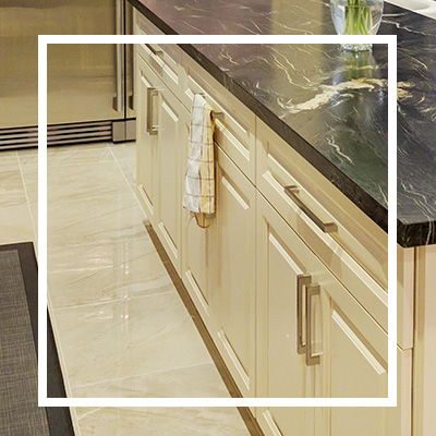
We managed to help the client cut down clutter by making sure there’s adequate storage room in the remodeled space. We gave the cabinets sleek hardware and simple mouldings to completely change their look. The cream color of the cabinets blended perfectly with the darker colored backsplash and countertop.
Fitted refrigerator
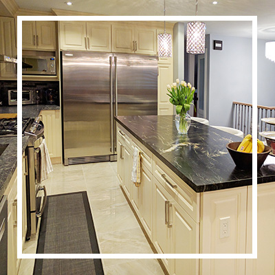
This fitted refrigerator helps to save so much space in this rather small area. We opted for this counter-depth refrigerator in order to also give the place a clean profile since the client wanted to achieve a minimalist and clean look. We framed the fridge with panels in order to appear like a built-in model. Overall, the appliances looked perfectly in place and blended well with the countertop, backsplash and hardware elements.
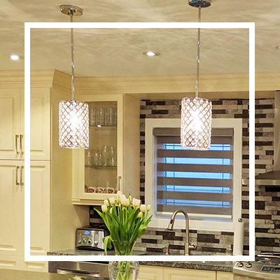
Switch up the lighting
We opted for a more stylish and targeted kind of lighting for this project. The idea was to create some dramatic effect without stealing the beauty of the place. This retro-contemporary lighting suits the kitchen well and goes along with the mini bulbs fitted on the ceiling.
There are many other elements that stand out for all the right reasons in this renovation project. For instance, the beautiful chairs add functionality and comfort in the space. We chose the style of chairs because they help to add a modern feel without consuming too much space. The chairs can be easily tucked in below the countertop helping to maintain a clean and organized kitchen.
We also offered other renovation services to the client such as removing the popcorn ceiling, patch ups and repainting the wall. Other ideas that can still work well for this space include customizing the storage with features like pullout trays to avoid cluttering the countertops. The client loved the remodel and even referred us to some of her friends.


