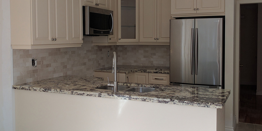
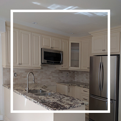
We always love a cringeworthy kitchen that ends up looking beautiful. Before this kitchen looked so cramped and loud. The darker colored cabinets did not complement the backsplash nor the rest of the elements in the space. We knew we had a lot to offer this client the minute we stepped in. Our ideas were centered around creating lots more breathing room and making the area feel airy by changing the main colors and going for lighter shades that create an illusion of a larger space. After signing the contract with the client, we went ahead to perform several upgrades to come out with stunning results which she loved.
We started with the cabinetry
The cabinets had a darker finish which made the place appear even smaller than it actually is. We transformed them from the traditional light brown to a sleek cream finish that blends well with the countertop and appliances. This lighter color also makes the small kitchen feel larger. You’ll never go wrong with off-white cabinets. In this case, we paired them with a sophisticated granite countertop and a tiled backsplash. The other finishes on different elements like hardware, appliances and faucet appear nicely put together.
Upgraded appliances
Sometimes all your kitchen needs to give it a brand-new look is some new energy-efficient appliances. The convection ovens and high-tech range hood have just the right finish to blend well with the cabinetry and countertop. Other hardware elements in the space also go along really well with the appliances. It’s a great way to enhance energy efficiency and enjoy a better-looking place.
 Updated existing hardware
Some of the existing hardware looked worn out and needed some major upgrades. We made sure the cabinet hardware complemented the rest of the space. We managed to create a cohesive look by blending different kinds of hardware such as the knobs, pulls and faucet.
Added an interesting backsplash
We selected the ideal backsplash material for this project. The tiled backsplash is not just easy to maintain but also blends well with the countertop. We love how the pattern of the backsplash added interest and movement to walls. We chose tiles for the backsplash that match well with the flooring.
 Gave it the perfect countertop
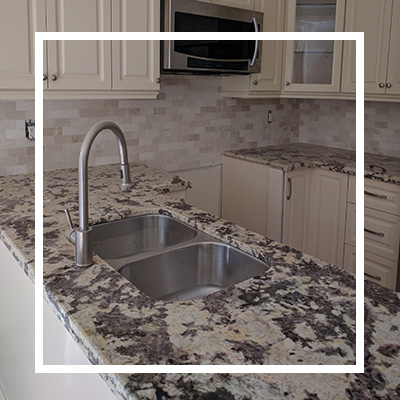
To get the look and texture of stone, we chose a granite countertop that is both cost effective and easy to keep clean. We transformed the countertop from a simple and plain white surface to a dramatic partnered surface that adds spice to this place. We love how quickly the countertop has changed the atmosphere from boring to exciting. The colors also go along well with the other elements in the kitchen like the flooring and backsplash.
We worked on so many other areas in the space such as the soft-closing hinges and glides to make sure the doors and drawers don’t slam. We completely removed the existing cabinets and added new ones with a different color and finish. We also installed pot lights on the ceiling.



 Updated existing hardware
 Gave it the perfect countertop
