To really bring out a contemporary vibe, we tried to maintain a neutral design which can be easily personalized to reflect one’s individual style. A kitchen that has light gray and whites and as the main colors can be easily matched with other bolder color palettes like lavenders and purple in the rest of the home. We really managed to spice it up with paint.
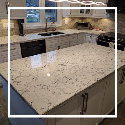
The beauty of quartz
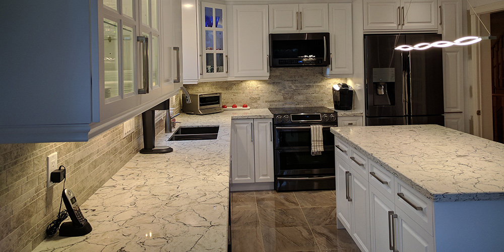
This homeowner wanted natural stone on the countertop but the budget was rather limited for this material. We recommended a quartz countertop instead and look how gorgeous that turned out. Quartz countertops are currently on trend. They come with really nice neutral colors and are very durable plus easy to maintain. The countertop for this kitchen design gives an ultra-modern and sleek contemporary look. Quartz is not just nonporous but also resists heat so you don’t risk damaging your counters every now and then. What’s even better is that this material is resistant to spills and scratches. This type of countertop is very ideal in a busy kitchen or for larger families.
A seamless look
Gone are the days when the kitchen looked very dissimilar from the rest of the home. In this design, we made sure to use elements that complement the rest of the space. Our goal was to create a seamless look by combining the right light fixtures, flooring, counters and drawers to give the room a look that is not just distinct but consistent with the rest of the home. The white, gray and black hues complement the home’s flooring, walls and fixtures. We made sure not to stray far from the home’s color scheme.
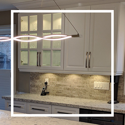
From brown to white
One of the major changes we made in this kitchen was the look of the cabinetry. Previously, the cabinets were brown and did not create a good color contrast with the rest of the space. We wanted the cabinets, including hardware such as drawer pulls, to match the appliances and faucet among other items. We also knew that changing the color of the cabinetry from brown to white will make the place appear expansive by opening it up.
Backsplash and floor tiles
We chose the perfect tiles for the backsplash and flooring, making sure they complement each other and bring out the desired contrast. In the previous design, the backsplash did not stand out at all. The current design of the backsplash has a unique texture and feel that matches the flooring.
Appliances
We knew the appliances had to match the rest of the elements. That’s why the white refrigerator had to go. We replaced the fridge with an energy efficient model with a stainless-steel finish that perfectly fits into the new design.
Let there be light
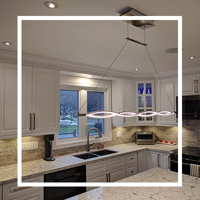
Last but not least, we made sure the kitchen has adequate lighting to spice it up even more. The lighting fixtures added on to the beautiful look of the new redesigned space. We love how well everything fell into place in this renovation project.


