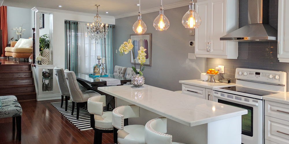
It’s often said that the kitchen is the heart of the home. In this project, we wanted to plan a new design that felt nothing short of breathtaking. If you are ready to renovate your cookhouse but you don’t really know where to start, we’ve got just the right project to inspire you. After designing so many kitchens for many people, we knew just what we needed to do to transform this space.
Add character with special lighting
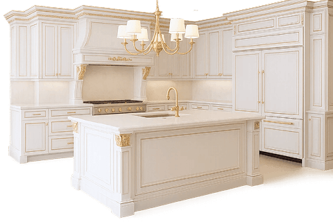
We knew some good lighting would instantly change the ambience in this modern kitchen. That’s why over the countertop, you can see some stylish lights hanging to illuminate the work area and give the space the personality it needed.
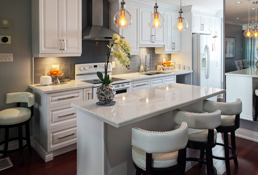
A modern color palette
We had to change the color palette of this kitchen to give it a contemporary and sleek look. Our goal when choosing the white and gray elements was to create a design that is both timeless and appealing. White has been used generously in the space to open it up and also give an illusion of a much larger setting. We added a darker shade of backsplash which helps to break the monotony of white and also blend with other elements like the appliances and hardware.
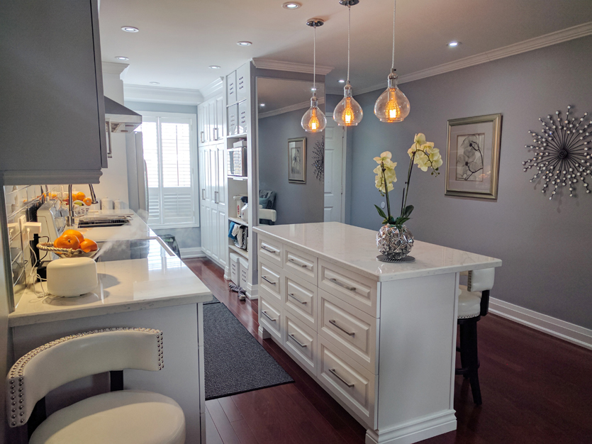
We added a contemporary flair
The place was in dire need of some modern features that created visual interest. We achieved this by adding some beautiful details and finishes that did not even cost a fortune. The backsplash added a high end look at a cost-effective price. The stunning quartz countertops are easy to clean and maintain. They were certainly a smart investment given that quartz will not need to be resealed over time.
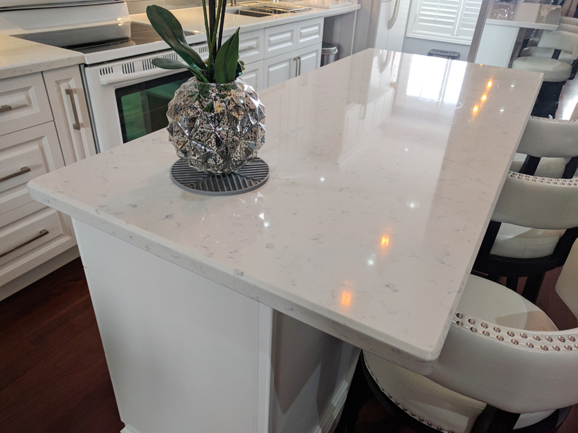
We made it ready for entertaining
Our remodeling experts made sure this new space is open and inviting by adding some extra seating that complements the seats on the dining area. The unique design of the seating added some glitz and glamor in the room. We removed the seats on the dining area and replaced them with a more stylish alternative. The island acts more as a place to entertain and for kids to do their homework as they grab a bite.
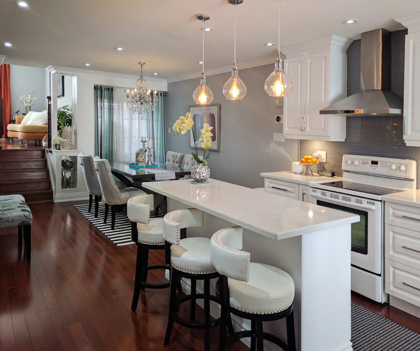
Classic white
You can never go wrong with white in the kitchen. In this case, we wanted to clean up and achieve a minimalistic and modern look. White also allows the kitchen to let in more light. We also incorporated some shades of gray and stainless steel to warm up the place. Overall, the color scheme really contributed to the unique design.
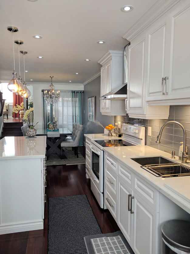
Overall, the new design was not just aesthetically pleasing but functional too. We ensured the client enjoyed extra storage space and decluttered the countertops by providing additional cabinetry. The open drawers also helped to provide storage for the smaller appliances like the microwave and toaster. Small changes like replacing the cabinet and drawer pulls made a dramatic impact on the look and feel of this space.


