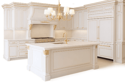
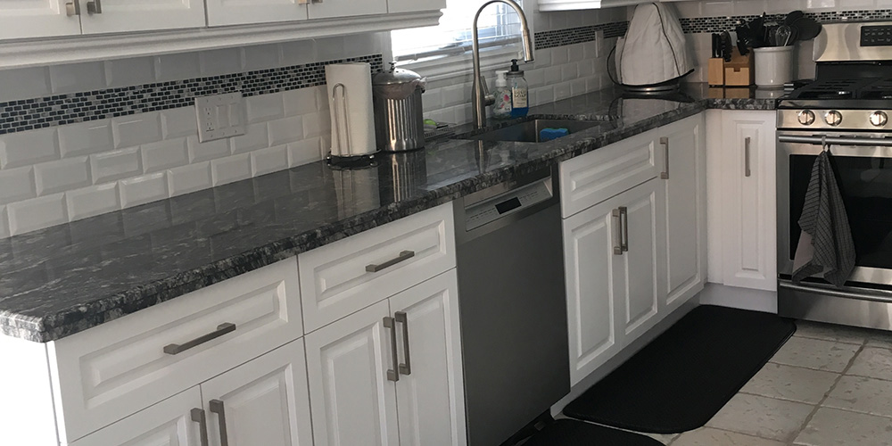
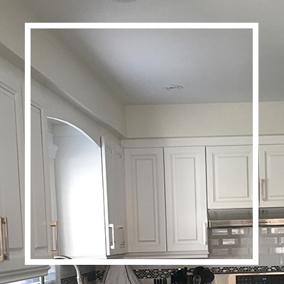
This kitchen remodel presented a unique kind of challenge we always love to take head on. The previous design was a dull kitchen island that needed a major uplift. We knew that adding some smart details will completely transform the space. This included working on the finishing touches such as the crown moulding, cabinet hardware and countertops.
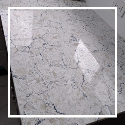
Granite countertop
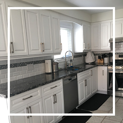
In this project, we opted for a granite countertop with stunning designs to add character in the dull-looking space. Granite is a great option for countertops since it is easy to keep clean and cost-effective.
Beautiful backsplash
The existing backsplash looked old and outdated. We had to replace it with beautiful accent tiles that complemented the countertop. Good thing with tiling on the backsplash is that it’s durable and also easy to clean. We chose a tiling material that is easy to wipe off and resistant to spills so that the homeowner can maintain its clean and appealing look. The backsplash color also matches well with the flooring and countertop.
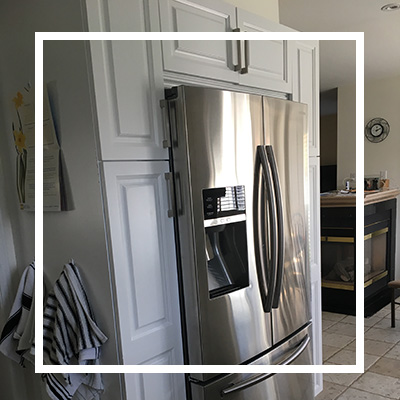
New cabinetry
This project involved the removing and disposal of existing cabinets to pave way for more functional and stunning cabinetry. We installed granite-topped cabinets to provide additional storage and make the room more functional. The hardware elements on the countertops were carefully selected to complement the rest of the space. We ensured the drawer pulls and cabinet door knobs also added a little bit of glam to a place that needed a major uplift. Painting the cabinets white also helped to create an illusion of a larger area.
Lighting
We also installed beautiful pot lights above the sink. We installed pot lights on the ceiling as well as puck lights under the cabinets. We removed the outdated lighting fixtures and provided better illumination to brighten up the space.
Stylish sink
We also supplied and installed a beautiful emerald sink together with a silver faucet. The sink and faucet complemented the granite countertop really well. The 28” sink provided adequate space for cleaning up the big pots and pans that would normally be a headache to keep clean in a small sink.
Painting
Fixing this place proved to be a cost-effective project thanks to white paint and cheaper material alternatives. We wanted to come out with a clean and minimalistic look hence we chose to paint the walls white. White walls beautifully brighten up the space and make it appear larger than it actually is. It was also easy to match the appliances, flooring, countertop and other fixtures/fittings with the white and gray color scheme.
If you are looking for a budget-friendly surprise, get inspiration from this kitchen remodel. You never have to spend lots of cash on costly custom cabinetry or fixtures. We managed to make do with what was existing and introduce some cost-effective makeovers to revamp the space. We also incorporated clever storage options to make the kitchen more functional. If you are looking for an open and spacious kitchen, Kitchen and Bath contractors and designers are ready to start your makeover journey.


