10 Top Gorgeous Bathroom Makeovers
The bathroom is your own personal space where you get to retreat and relax away from the noise. As such, you have to ensure that it is designed to offer maximum comfort. Remodeling allows you to improve the adequacy of the room and embrace the newest designs in the market. If you find your bathroom design boring, then this is a clear indication that you need to give it a makeover soon. Below are some beautiful makeovers that can inspire you for your bathroom renovation Toronto.
From Outdated to Gorgeous Gray
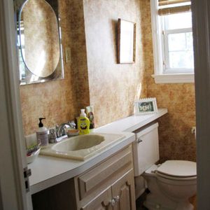
Before :
This was an outdated bathroom with sponge painted walls and an old toilet.
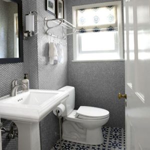
After :
The makeover focused on concealing the plumbing work by maintaining the original bathroom layout. The room was given a complete transformation by Moroccan cement floor tiles, a classic Kohler pedestal sink and an efficient commode.
From Ordinary to Vintage Farmhouse
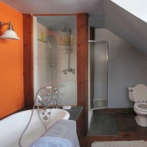
Before :
The orange walls and an abnormal layout made this bathroom ordinary and uninviting.
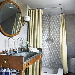
After :
It was transformed with a vintage tub and antique scones giving it a vintage farmhouse touch with a sense of history to the space.
From Tiny Tub to a Luxurious Shower
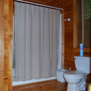
Before :
The tub insert in this bathroom was too small for one to enjoy.
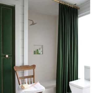
After :
The tub was removed to enlarge the shower space. Ceiling set curtains were used to create an impression of towering ceiling.
From Boring to Rustic Accent Wall
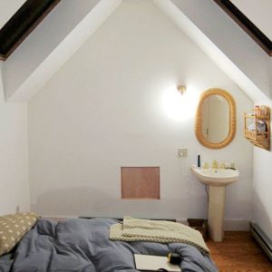
Before :
The room was blank and monotonous and clearly needed a facelift.
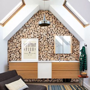
After :
With a rustic accent wall, the room became a centerpiece for the house. The wall is made of wooden slices attached to a plywood backing. The rustic accent wall brings out a good contrast to the rest of the white walls.
Builder Basic to Individualized Touch
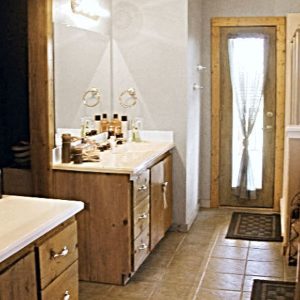
Before :
The bathroom remained unchanged since it was first built in the late 90s.
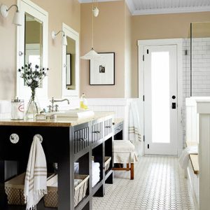
After :
A makeover was done to improve the aesthetic appeal and give it a more individualized look while retaining it’s original layout.
From Simply Boring to Simply Luxurious
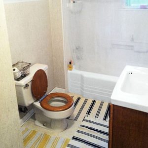
Before :
This bath was simply boring, cramped and lacked a sense of personality.
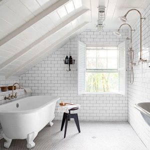
After :
The master bath’s square footage was increased by demolishing the second- story crawl space. The room was remodeled by fitting a claw foot tub and a dual shower. The window openings were widened giving the room more light. The floor was tilted slightly for better drainage.
From Messy to Absolute Glow
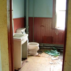
Before :
The home was divided into multiple residences thus there was no real master suite.
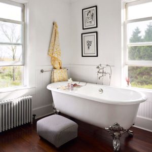
After :
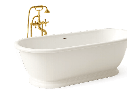
The renovation transformed the space into a beautiful space with a claw foot tub, a farmhouse style beadboard wainscoting and white walls.
From Dark to Bright
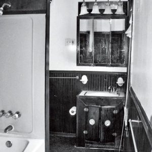
Before :
This cramped, upstairs bathroom was a dark disaster that needed major renovation.
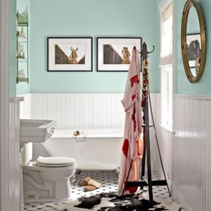
After :
The dark room got a makeover with a fresh coat of white paint and some Tiffany blue touches. The old unfashionable linoleum floor was replaced with Angled tiles.
From Brown to White
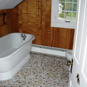
Before :
The owner’s biggest concern with this bath was the contrast between the mosaic tile floor and the walls.
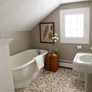
After :
The walls were painted soft gray to match the gray tiled floor. And the white in the room brightens the bath.
From Basic to Beauty
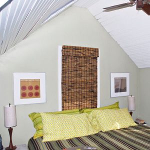
Before :
This master bedroom had a lot of potential for improvement.
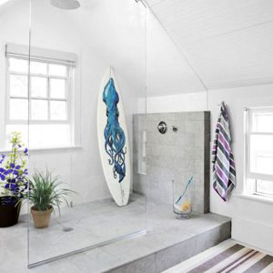
After :
The basic bedroom was transformed into a stunning bath area with a glass shower enclosure to help retain it’s spacious feel. The subway tiles on the walls highlight the limestone tiled shower floor.


