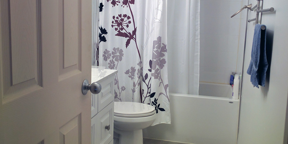
When you have a small bathroom, you are often left wondering what you can do to revamp it without spending much. This particular renovation was quite simple but we managed to give the space a completely new look.
Vanity
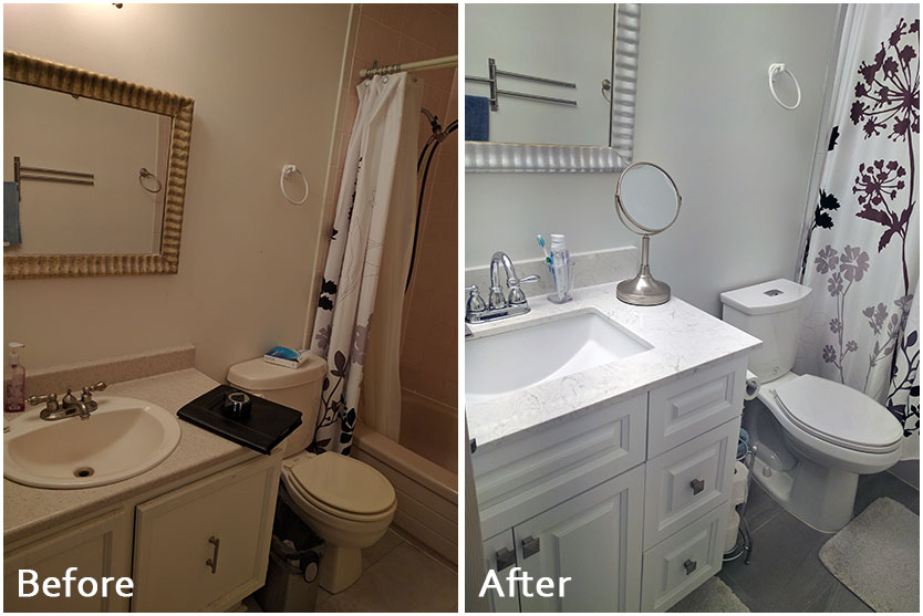
We wanted to make the vanity the focal point of this space. That’s why we chose a sleek design with a custom finish. In fact, the choice of vanity made the mini bath to feel larger. We love how the cabinets below the sink offer a place to store everything. We changed the type of sink from the traditional oval shaped to a stunning rectangular sink with lots of space. We updated the mirrors and faucet as well to give the bathroom a more modern feel. The vanity now looks nicely put together with a white and gray color scheme.
Cabinetry
With such a small area, you certainly could use extra storage to keep things clean and tidy. We changed the cabinets below the sink to accommodate more storage areas. We included a few more pull out drawers, painted them white and installed unique drawer pulls that contributed to adding some character in the small place.
Faucets
The faucets we choose are not only more functional than the previous ones but also added some beauty and character in the space. They have a nice silver finish to complement the other elements such as the small mirror. We selected high quality fixtures in order to provide this client with value for money.
Flooring
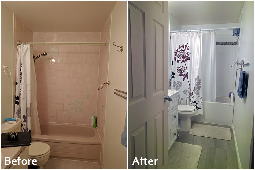
We also installed porcelain tiles on the floor to blend well with the wall and vanity. Porcelain is an excellent choice for bathroom remodels since it is nonporous and scratch resistant. Porcelain tiles are also easy to maintain and cost-effective. The color we chose for the porcelain floor tiles blends perfectly with other features in the place.
Fixtures
The silk beige countertop was an excellent choice. There are other fixtures such as the quartz countertop and undermount sink which were uniquely chosen to blend with the rest of the design.
Bathtub
We also installed a new 60’’ bathtub. We maintained the existing bathtub layout design which was an alcove since it’s easy to install and cost-effective. Also, other types of bathtubs such as a freestanding tub wouldn’t be ideal for such a small place. The walls of the rectangular alcove bathtub were painted white to match the rest of the space.
Painting
As with most small spaces, including shower rooms and kitchens, painting the walls white helps to make the place more airy and open it up. We painted this particular bathroom white in order to achieve this. The room looked smaller with the darker paint that was previously on the walls. We changed this and it instantly brightened up the place. The white color helps to allow more light into the space and also creates an illusion of a larger area. We love how well the entire remodel turned out and the client was happy too.
